Collection No.2
presented at

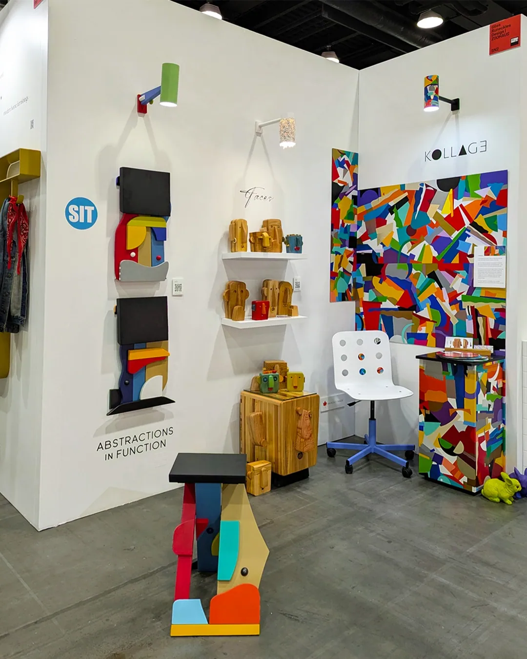
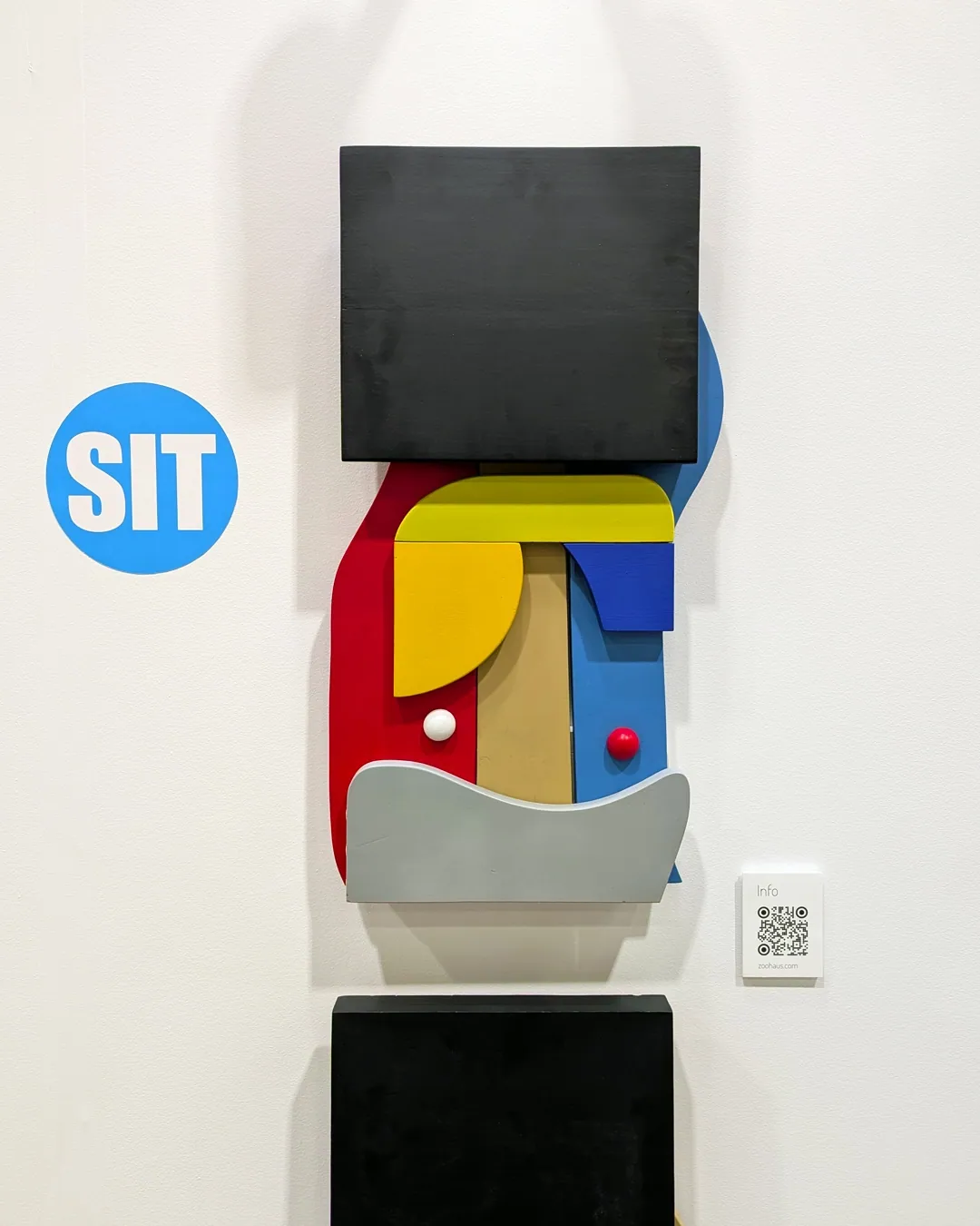
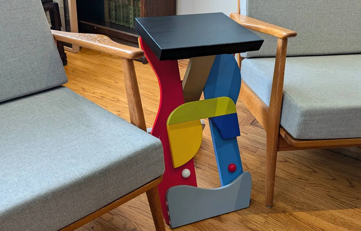
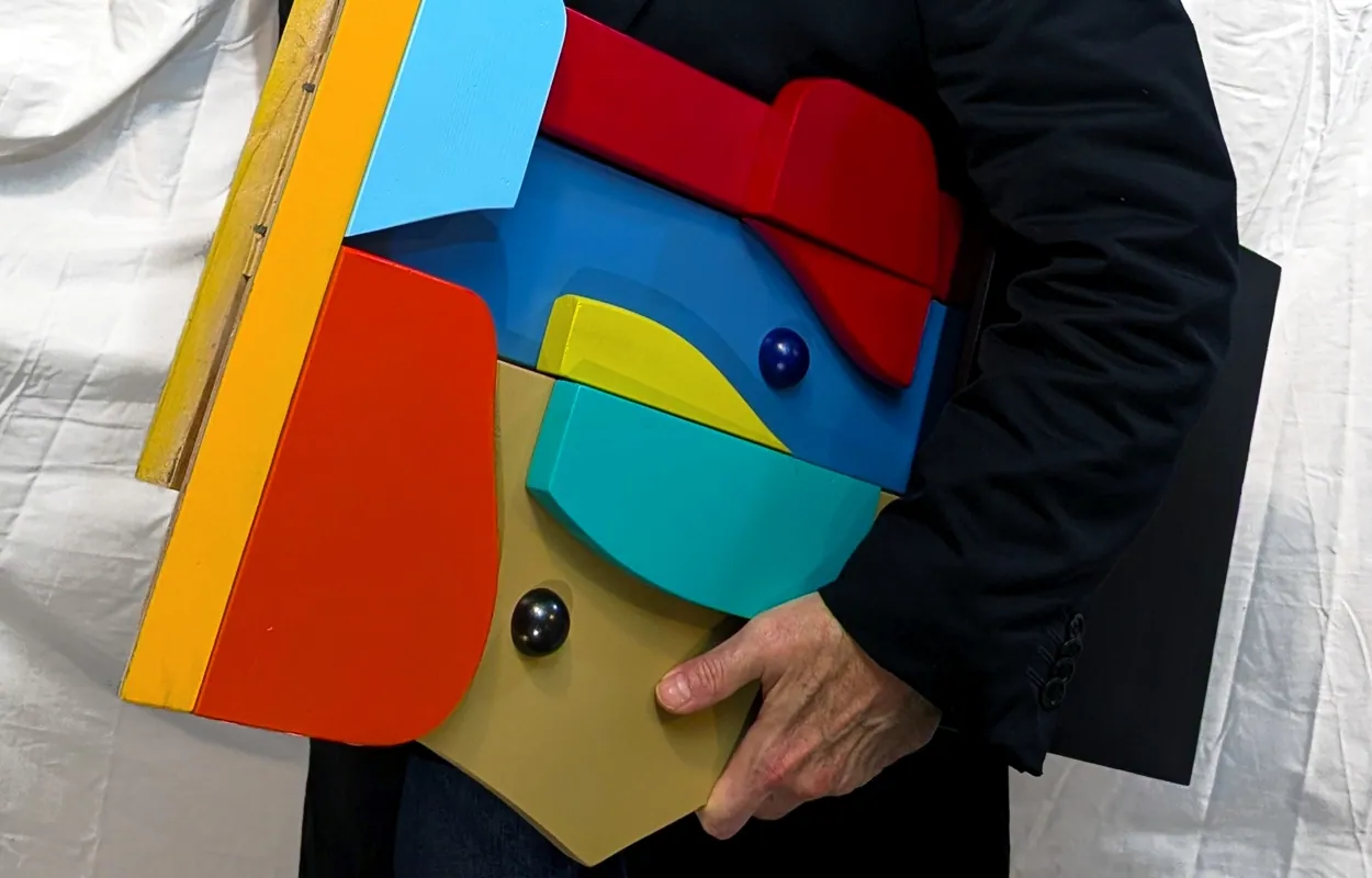
I'm absolutely thrilled to introduce and share with you the start of my new collection SIT.
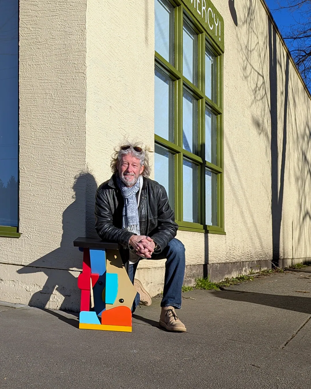
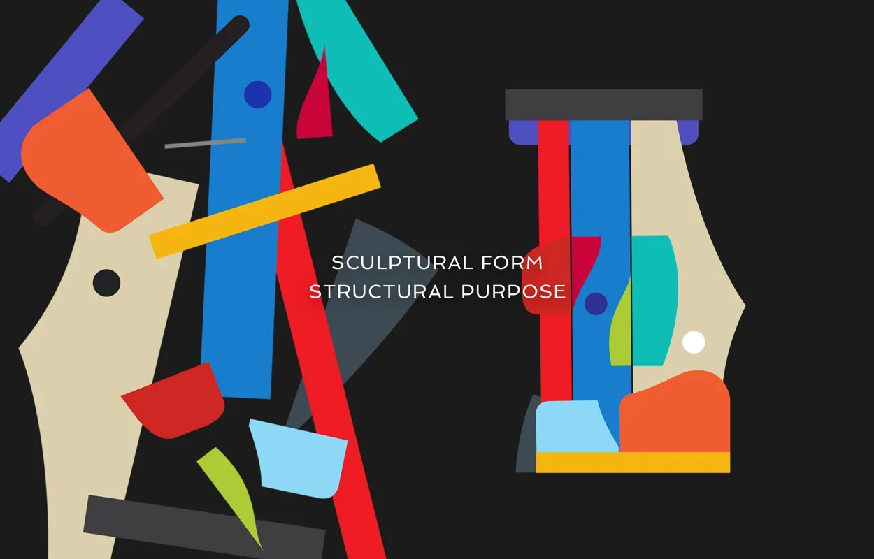
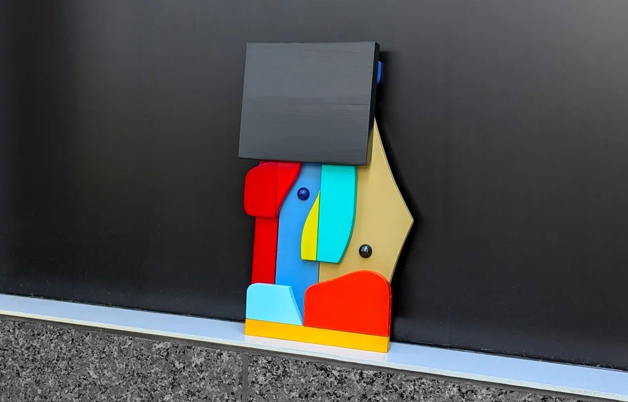
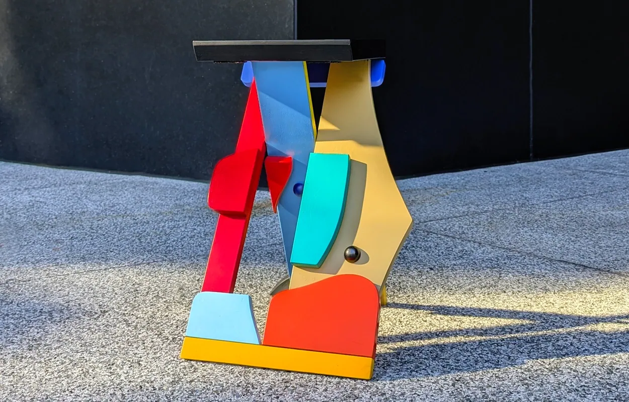
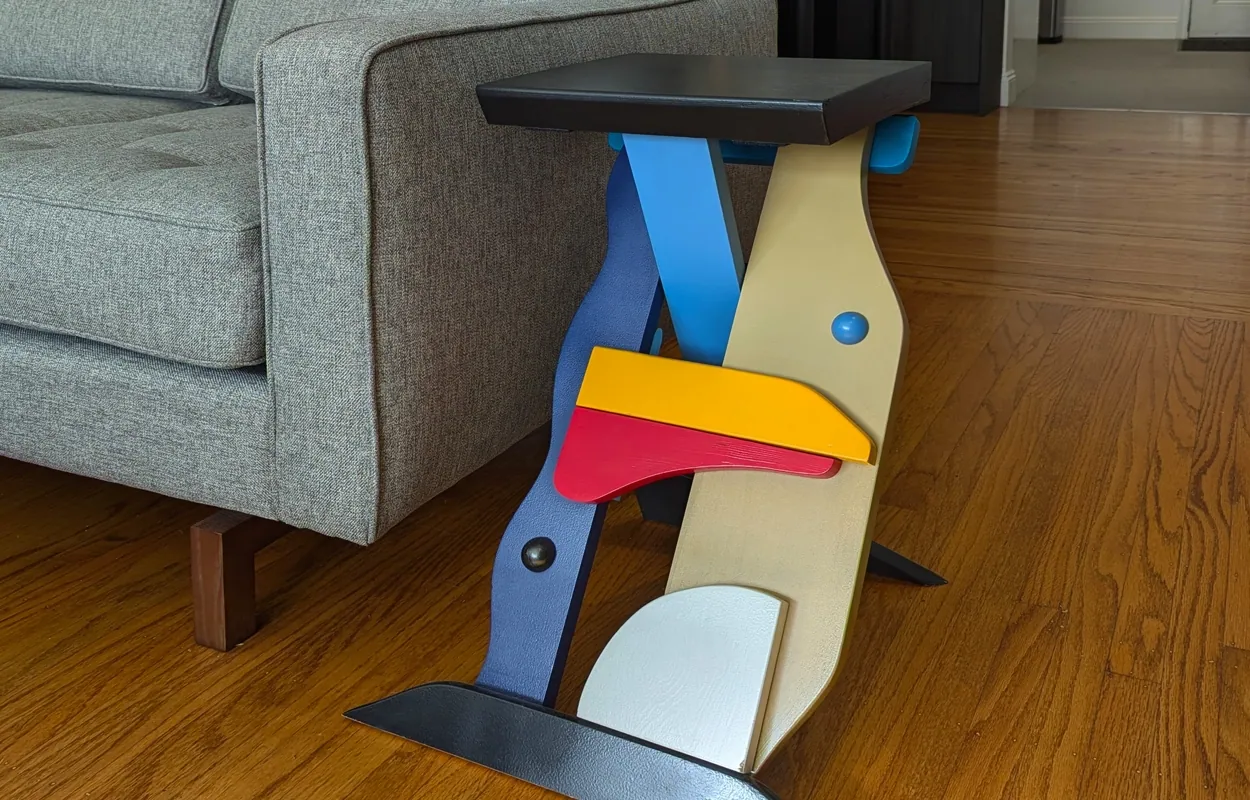
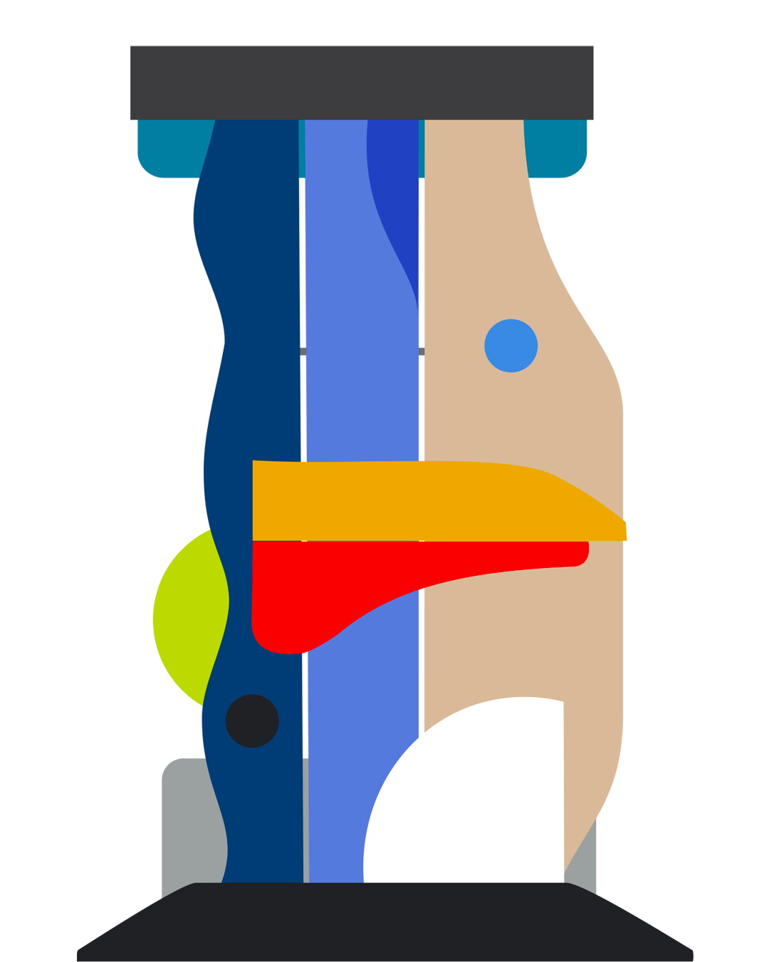
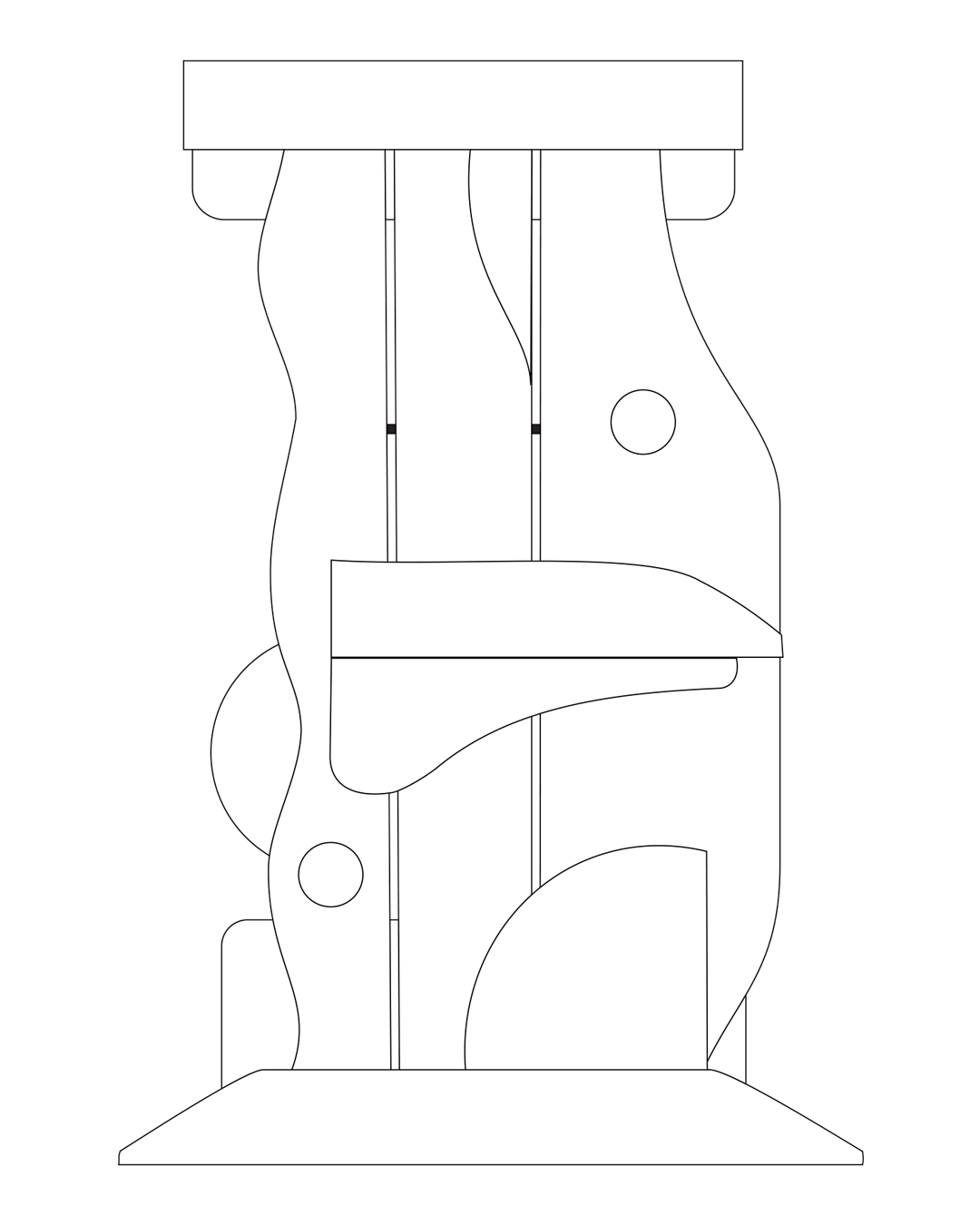
The SIT collection represents my on-going inquiry exploring relationships with furnishings, sculptural abstraction, presentation, fashion and play.
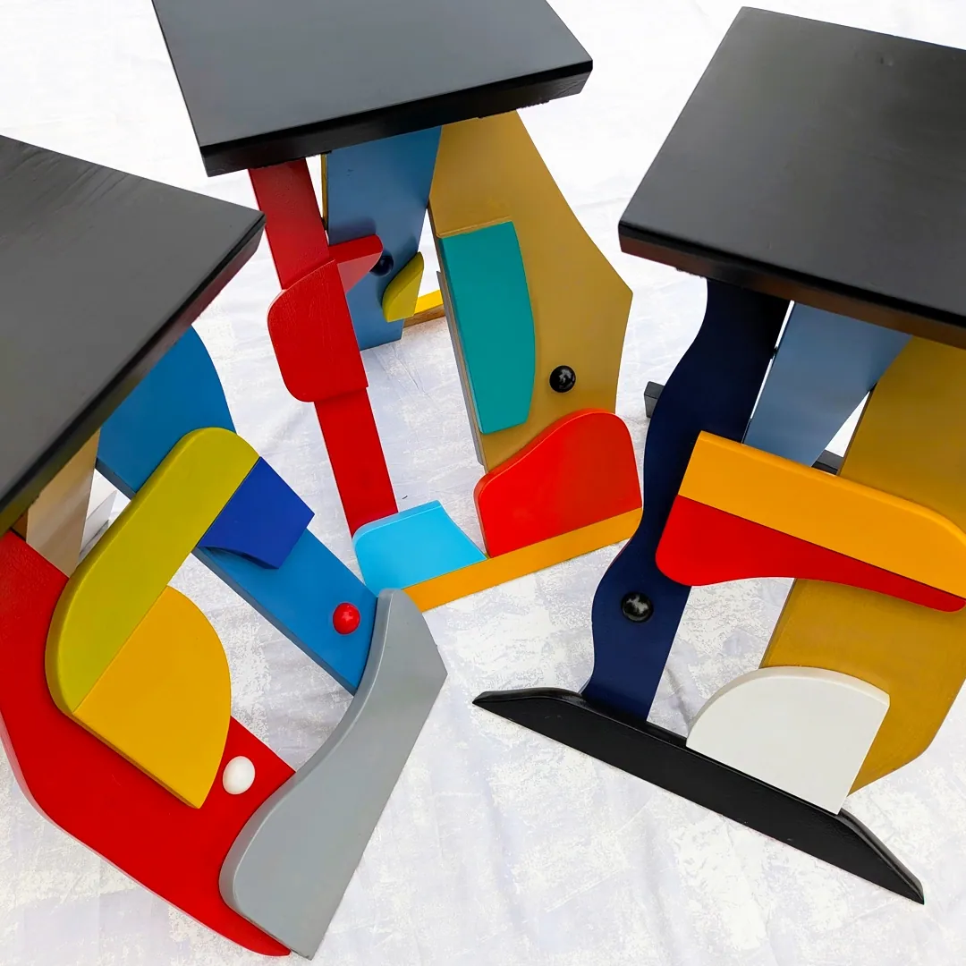
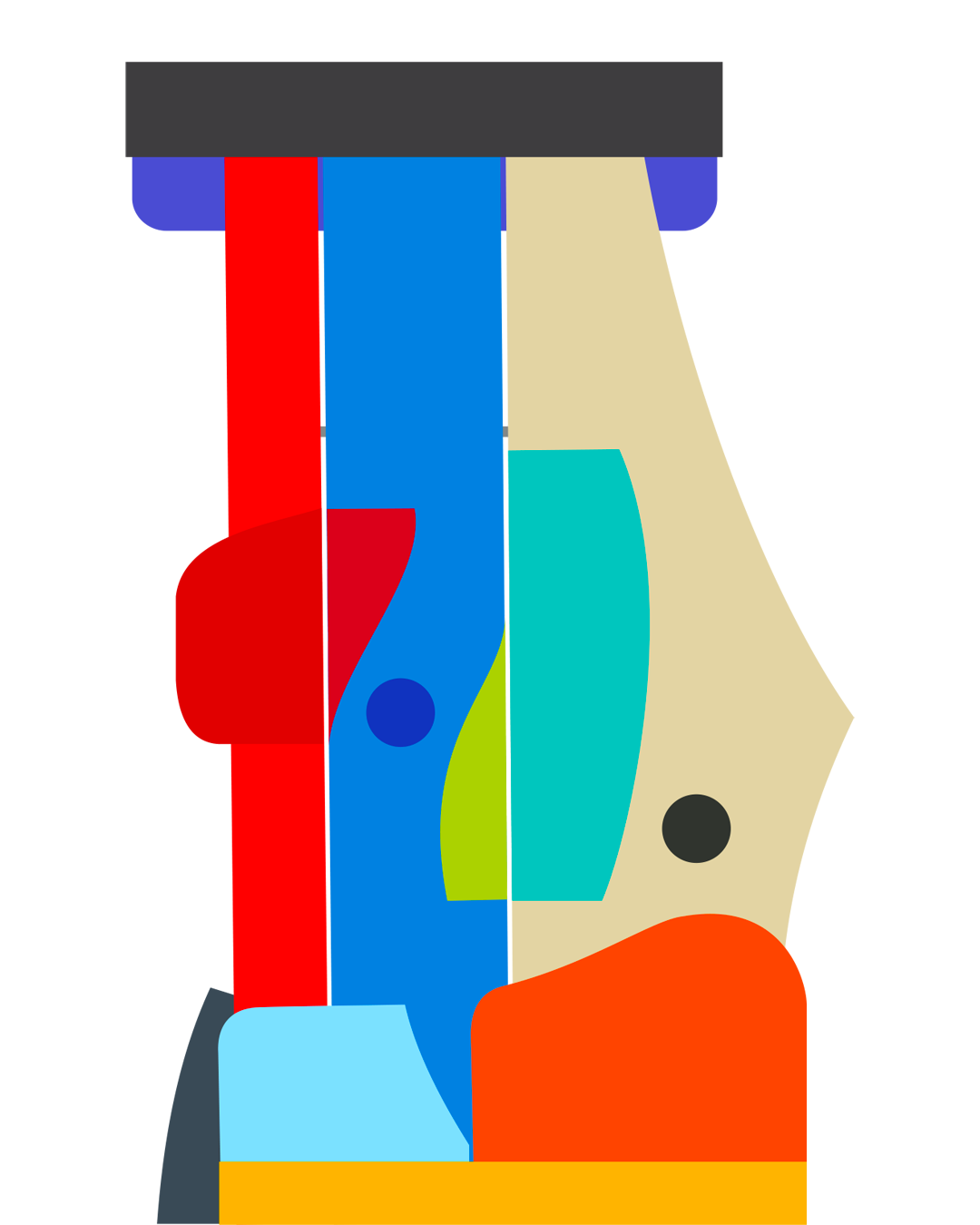
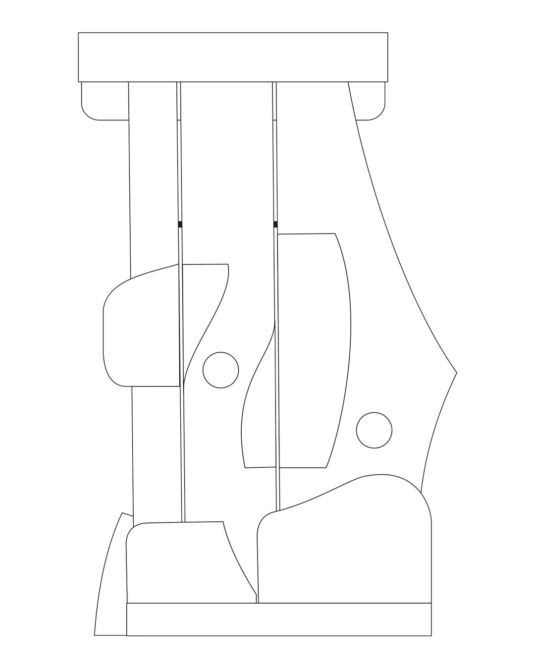
The very idea of saying "pull up a chair", "have a seat" or simply “sit”, can not only be taken literally, but perhaps might also offer new forms of expression and interaction.
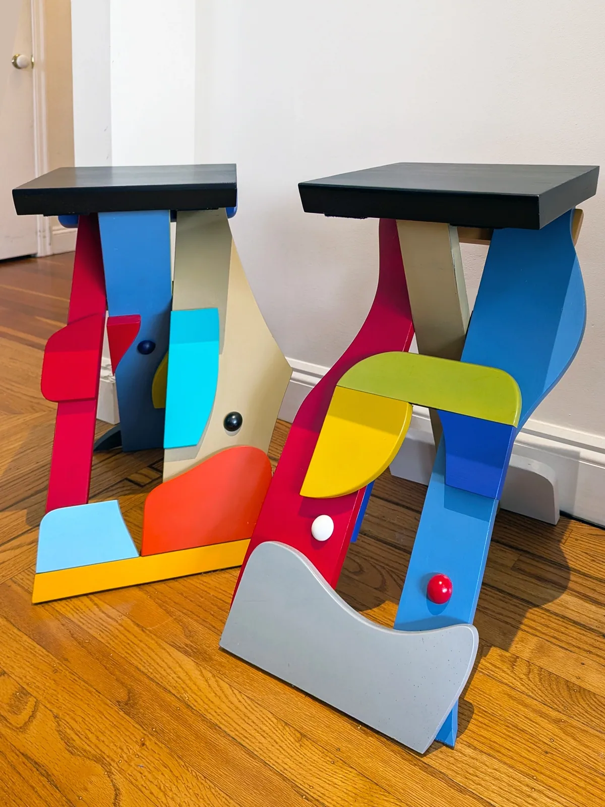
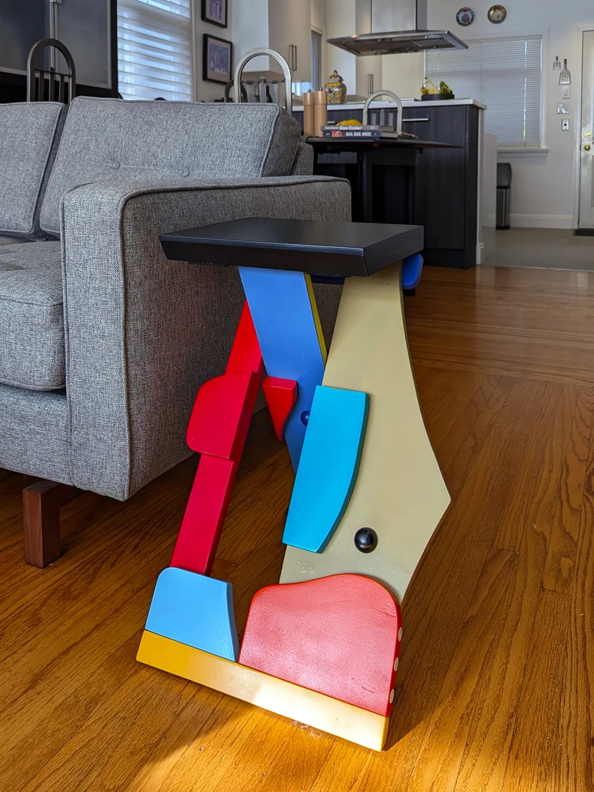
This exploration has led to the notion that furnishings might transcend the obvious and take on new meaning and purpose within a variety of space and use.
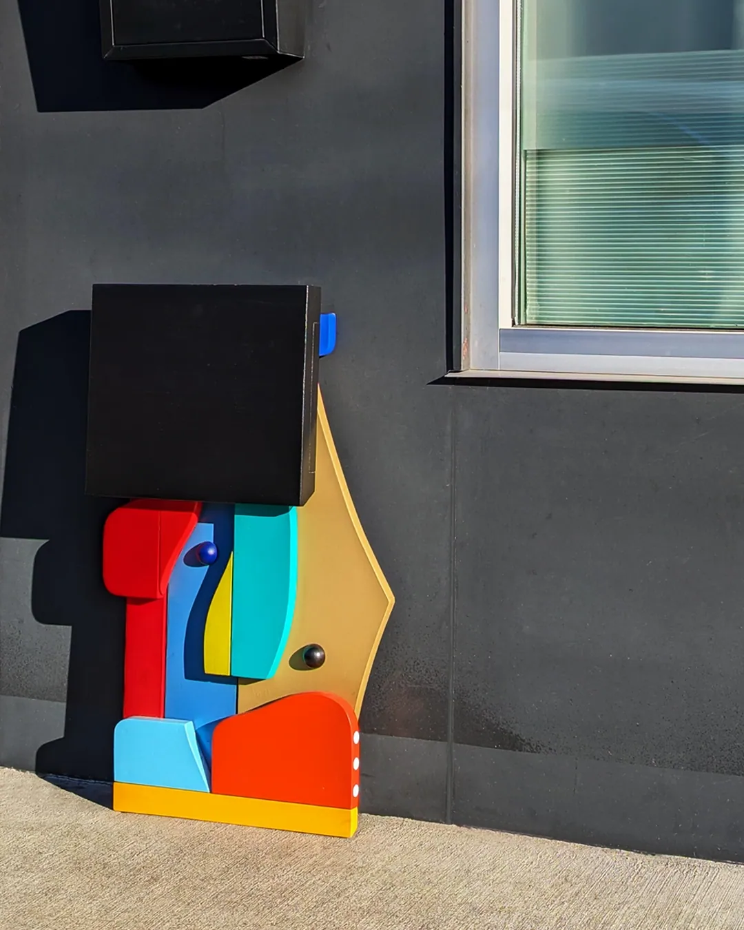
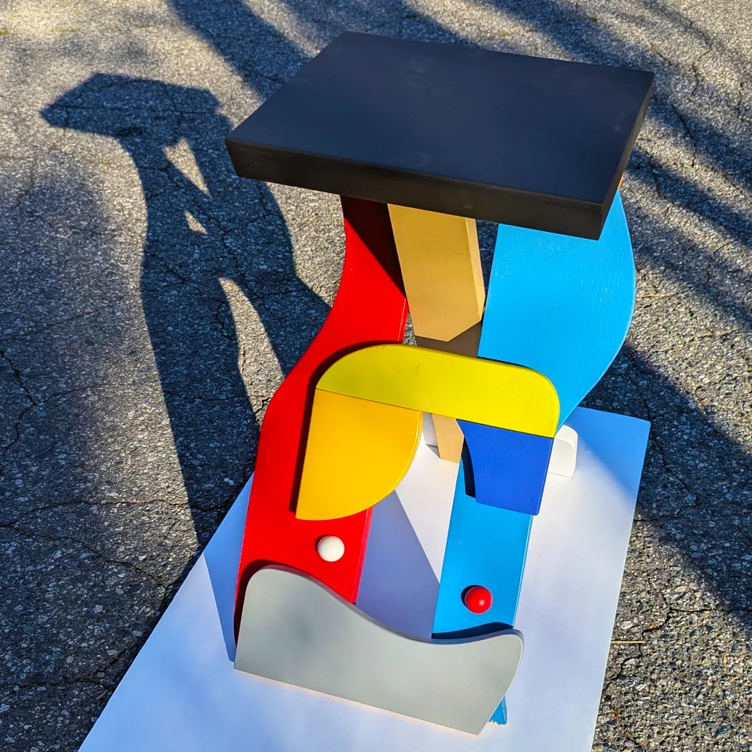
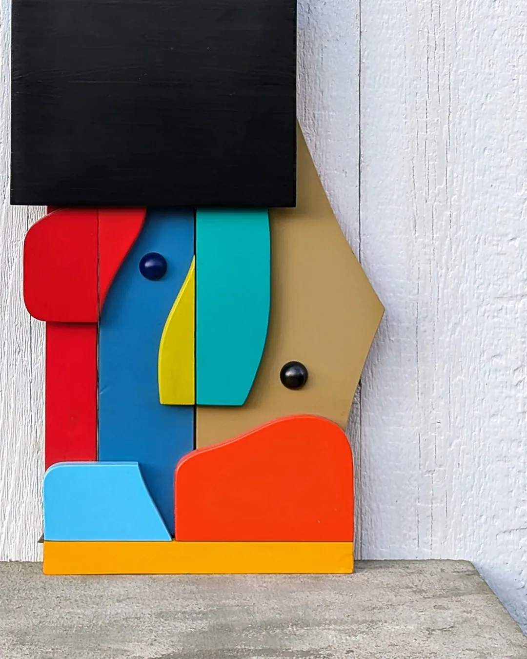
SIT can hang on a wall as an abstract form, unfold for a myriad of uses, take to the streets, augment ones wardrobe, offer rest and a pause, and above all promote the universal necessity of playfulness and adaptation.
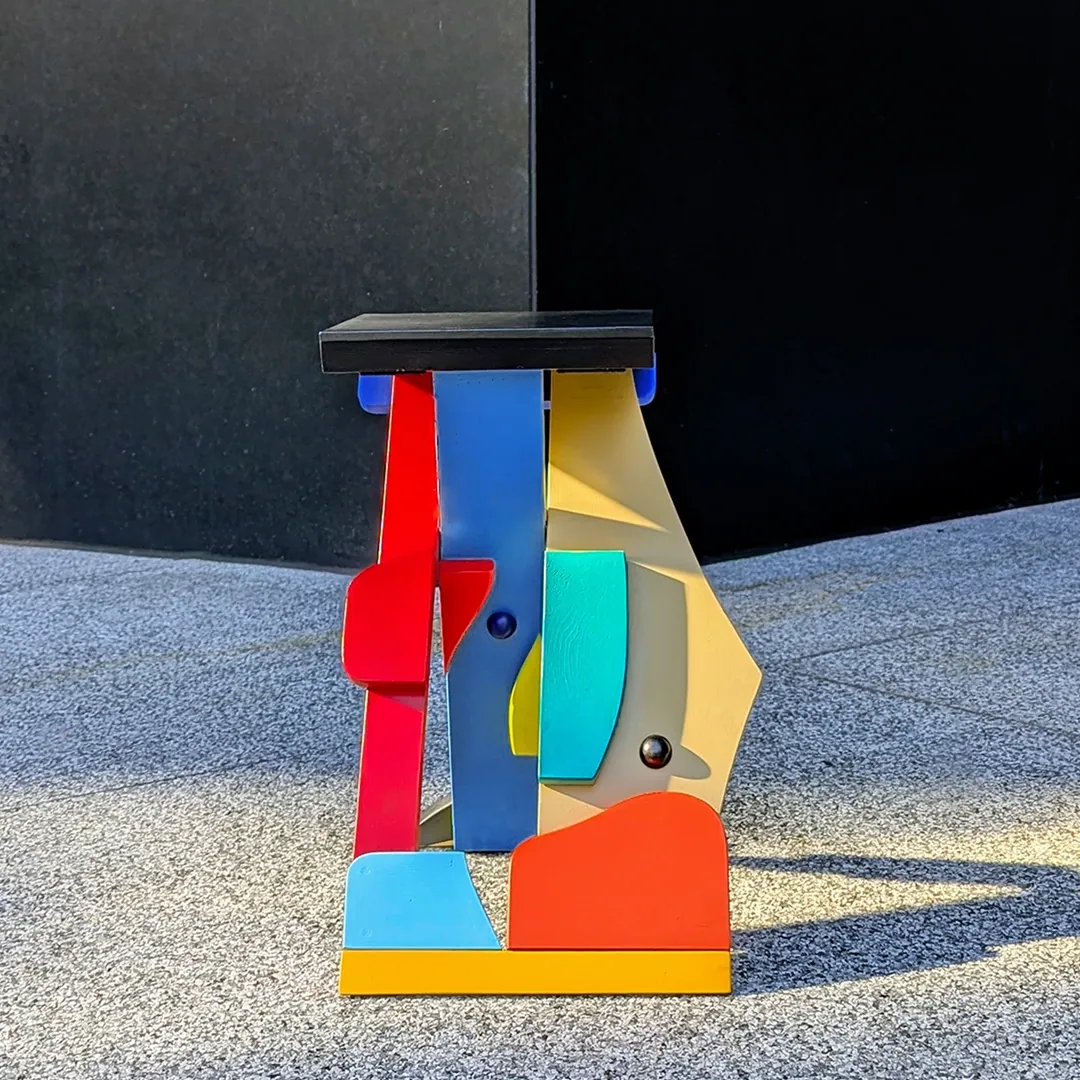
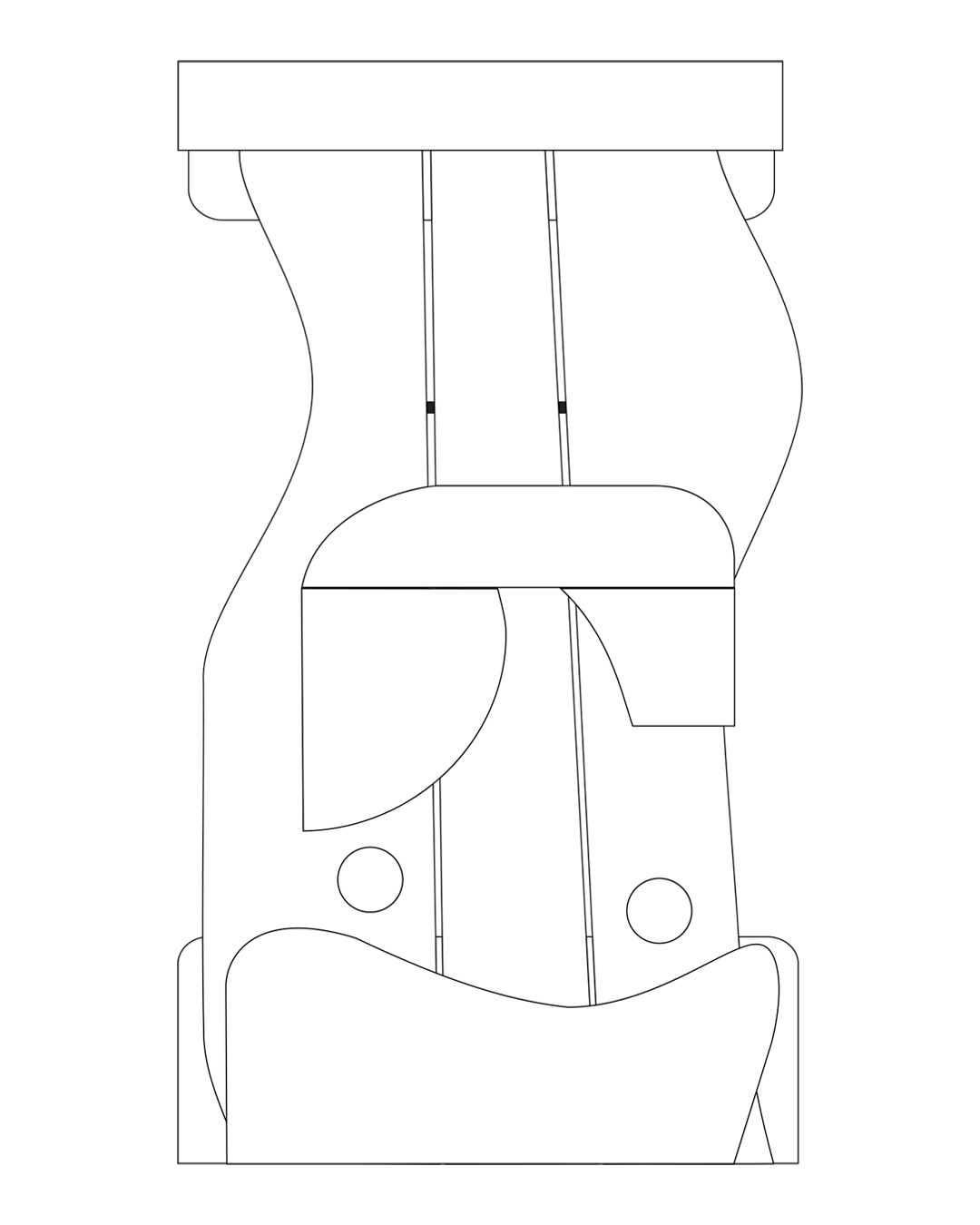
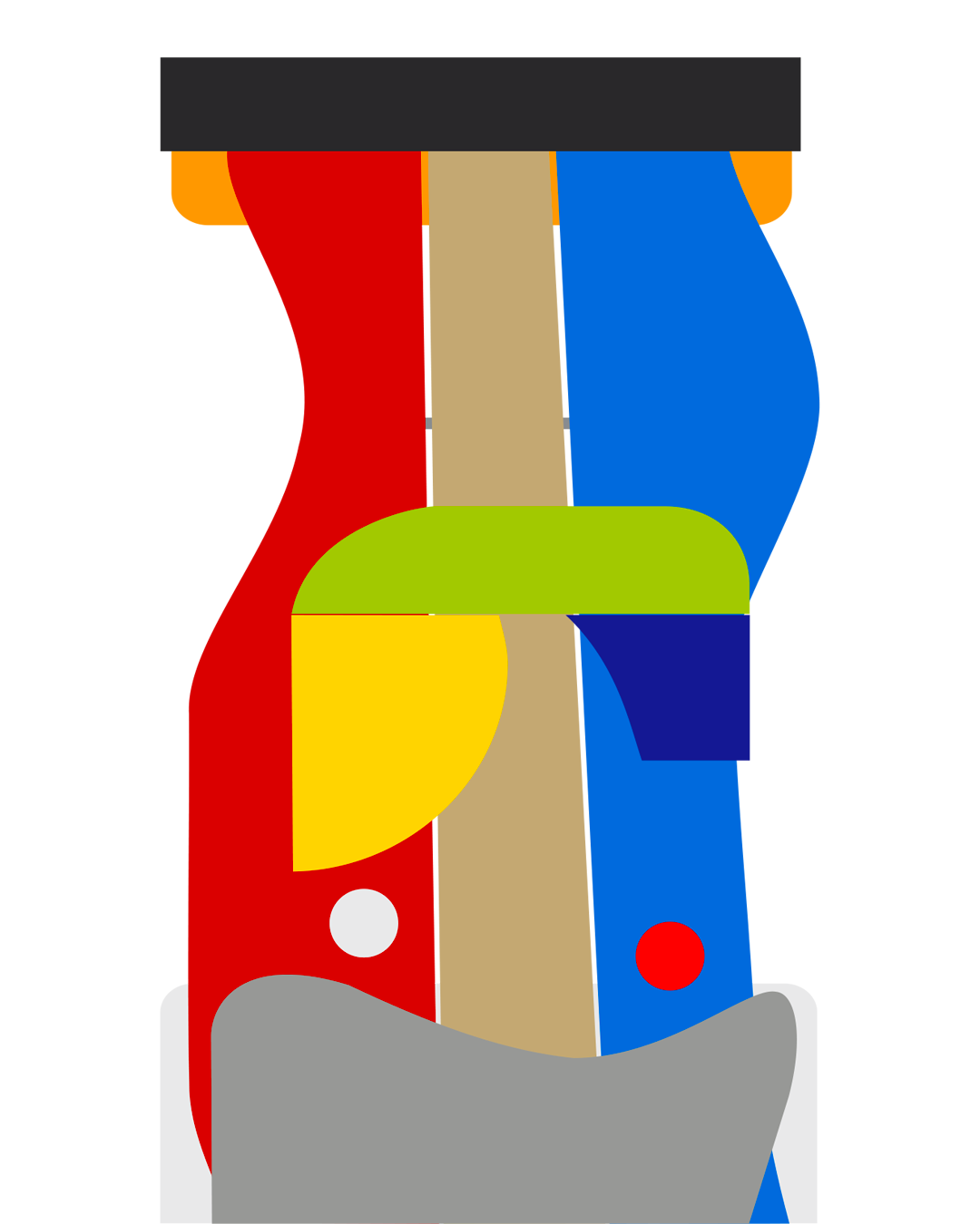
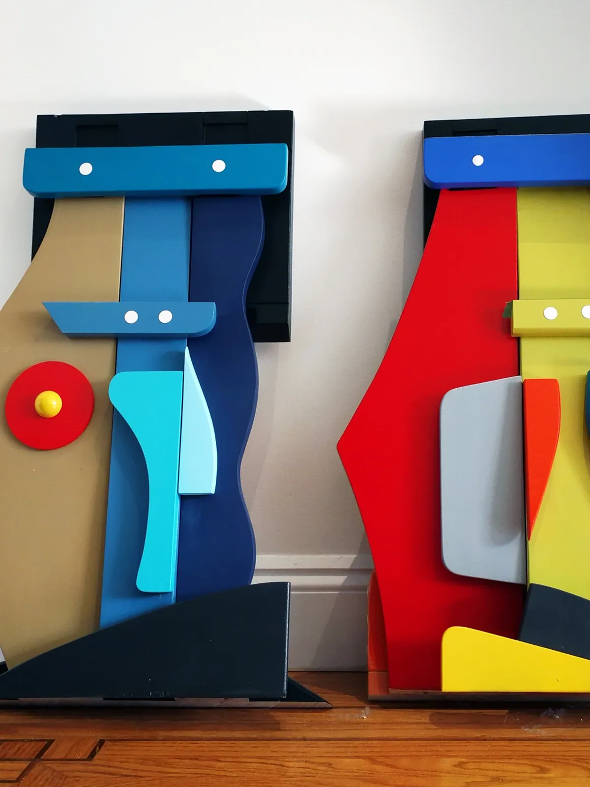
I see this collection through the lens of relationships with form, aesthetics, function & play, and I’m driven by the undiscovered, the impossible and unexpected, that our hybrid new world demands.
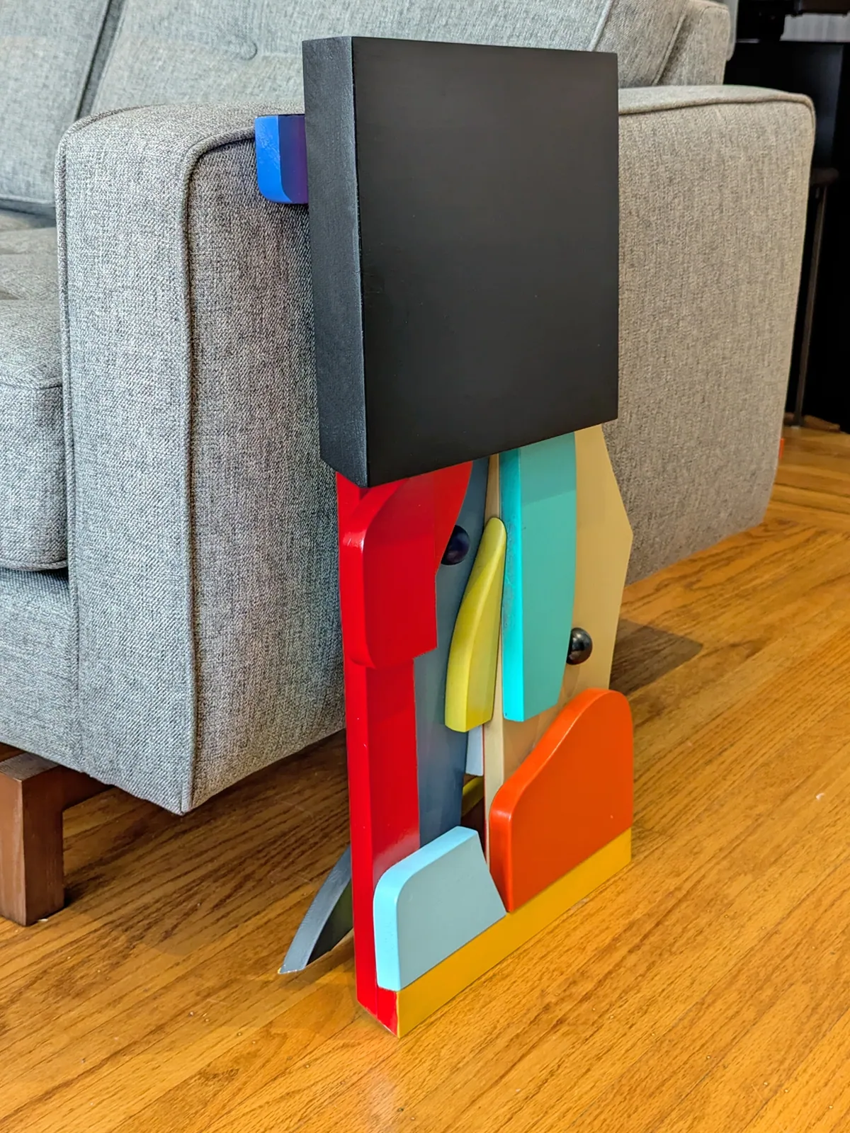
In keeping with my studio initiative R3 where material is reclaimed, repurposed and reborn, I’m thrilled that each SIT was hand-crafted with reclaimed wood sources and primarily finished with left-over, end of use materials.
For more information, sales inquiries, licencing & commissions, please contact Giles directly at: info@zoohaus.com


